Theming
The AppKit relies heavily on Unity Style Sheet (USS) variables for easy customization of various UI aspects, such as colors, spacing, border radius, and more.Preparation
The first step in theming the AppKit is to create a custom panel settings asset, followed by a custom theme file. Then, link them to the AppKit.- In Unity Editor, right-click in the Project window and select Create -> UI Toolkit -> Panel Settings Asset.
- Right-click again in the Project window and select Create -> UI Toolkit -> TSS Theme File.
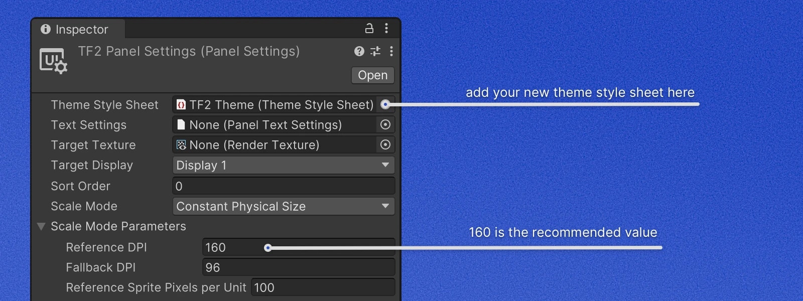
- Select the newly created Panel Settings Asset, and in the Inspector window, assign the newly created TSS Theme File
to the
Theme Style Sheetfield. - In the same Inspector window, set
Reference DPIto 160. This is the recommended DPI for the AppKit, but feel free to adjust it to your needs.
- Open the TSS Theme File with your code editor and change the first line to:
- Under
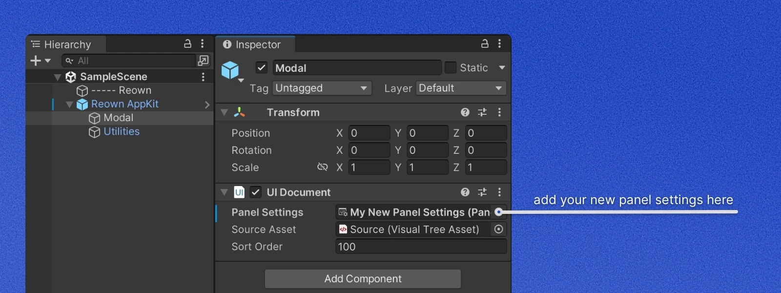
Reown AppKitprefab instance in your scene or prefab findModalchild object and assign the newly createdPanel Settings Assetto thePanel Settingsfield ofUI Documentcomponent.
Overriding Variables
To override a variable, simply add it to your TSS Theme File and assign a new value to it. The example below changes the accent color to a shade of orange and the modal border color to a shade of gray.If you find that a variable is missing, please open a GitHub issue.
We will be happy to add it for you.
Custom Fonts
To override the default font, you need to add a custom font to your project and reference it in the TSS Theme File.Advanced Customization
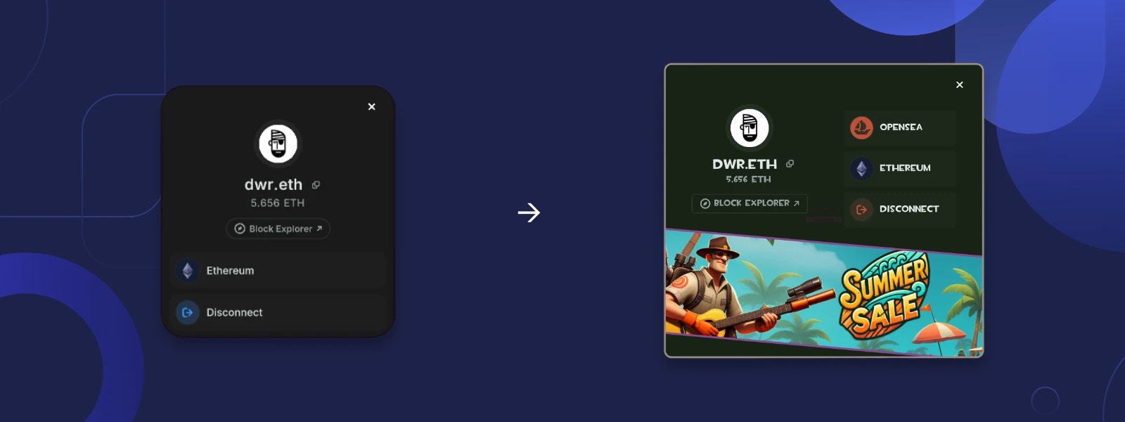
The AppKit follows the MVP (Model-View-Presenter) architecture, allowing you to customize the UI and behavior by replacing the default views and presenters with your own. Views load UXML layout files from the Resources folder and configure bindings. Presenters handle the business logic and communicate with the views. In some cases, presenters can build views dynamically and pass them to another view. Below are two examples showing how to customize both static UXML-based views and dynamic views.Dynamic View Customization
The Account view has a list of buttons at the bottom. At the moment of writing, there are only two buttons in the list:Network and Disconnect. Because in the future this list will include more buttons, some of which will depend
on project configuration, the list is built dynamically inside of AccountPresenter. In this example we will be
adding a custom button that opens OpenSea profile page of connected account.
Let’s create a custom presenter and override the method that creates the bottom buttons list.
CreateOpenSeaButton method from CreateButtons method. The final presenter should look like this:
modal view. The class that
is responsible for storing, hiding, and showing the modal views is RouterController. To replace a modal view implementation
with a custom one, you need to create a custom presenter and pass it to the RegisterModalView method of RouterController.
RouterController will dispose of the previous
presenter and replace it with the new one.
If you find that some parts of the presenter can’t be customized, please open a GitHub issue.
Static View Customization
All core views in the AppKit accept optional path to the UXML layout file in the constructor. Let’s extend theCustomAccountPresenter class we made in the previous example to use a custom UXML layout file.
To do so, override CreateViewInstance method and return a new instance of AccountView with a custom UXML layout path.